

Le Shio Redesign For Usability and Aesthetics
Project Overview:
Project Summary:
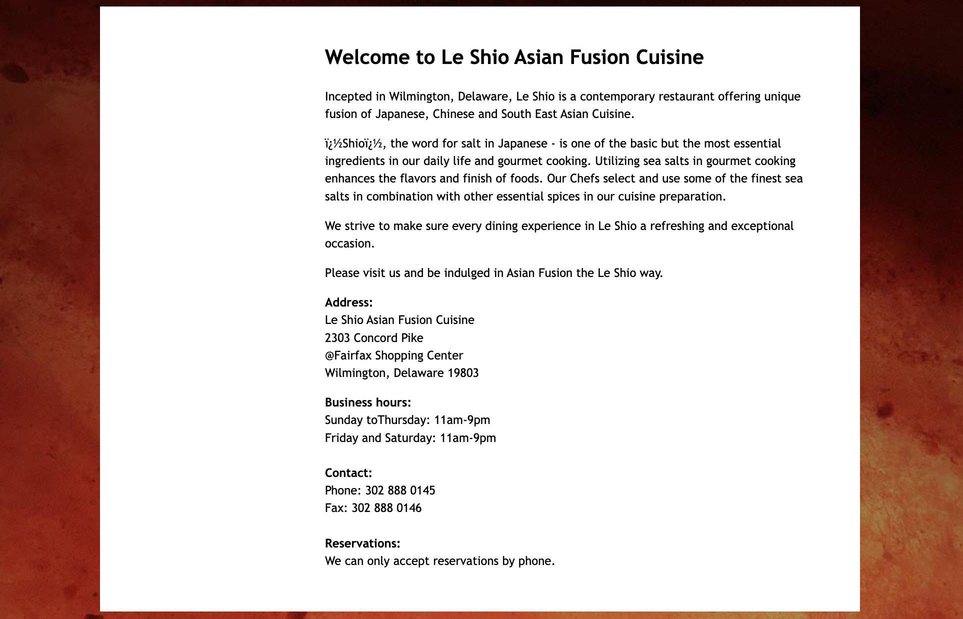
I created this project for a class that focused on advanced concepts of design, prototyping, and graphical user interfaces. Le Shio is a restaurant local to my hometown, and I recognized its website’s need for improvement in usability, ease of flow, and visual appeal. Originally, the website had bad readability, formatting, and a pretty plain and boring design. Through the use of extensive research, continuous iterations, and multiple rounds of redesign, I was able to spice things up by adding variety to the page layouts, making the typography and headlines more compelling, and introducing more interactive elements for users to engage with.
The Problem:
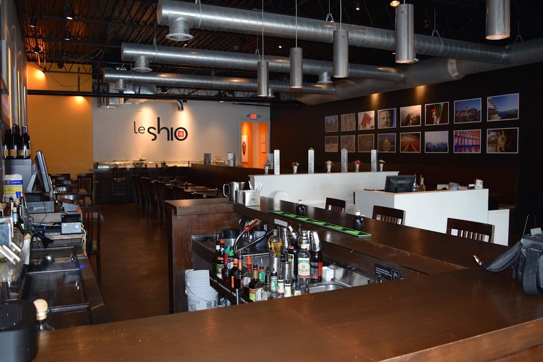
The visual appeal of this site was weak and lackluster. It had small writing and unreadable text, was non-dynamic and non-interactive, and required downloading PDFs and documents to view the menu. This resulted in a lifeless and not engaging interface for users, so I asked myself – “How can I improve this website not only in terms of design but also usability and organization?”

Research:
User Personas:
To prepare for this assignment, I gathered information about Asian fusion restaurants and their target audience, which includes a wide range of ethnicities and demographics. The user group would mainly include Asian adults ages 18-55 who are either culinary explorers or tech-savvy, looking to learn about the food or book reservations online. With this knowledge, I was able to create a user persona, Katherine Li, to help guide my designs and view my site from a new lens.

Pros & Cons:
While I was conducting my research, I analyzed Le Shio’s original website for positive and negative site components. This was an important step to help me identify my goals for improving this site.
Pros
Rotating image gallery
The movement due to the rotating gallery takes up less room on the screen and captures the user’s attention.
Header/menu
The page menu is organized by importance which helps the user navigate through the site with more ease.

Cons
Text
The text size was very small, the font lacked character, and there was no variety.
Formatting
The header and menu are properly aligned, but the text section under the rotating image gallery is not. The text is pushed to the center, but it is still left aligned. It made the margins seem uneven, with more space on the left side of the text and less on the right. The information is also all in one line, which is not captivating to the user and not very filling on the site.
Design Process:
Redesign Goals:
Taking all of these points into account, I made three goals to help concentrate my redesign on improving the user interface and experience.
1
Add variety to the site components and layouts on the different pages.
To do this, I planned to experiment with new shapes, colors, and organizations to see how they could be changed for the better. There was a lot of background/free space on the website, so I wanted to work with that to see how it could be more creatively incorporated.
2
Create more clear and effective headlines for the pages.
The names of the pages are under the image of the rotating image gallery, and not very bold. However, they can be changed to be larger and clearer if put in the center of the screen to capture the user’s attention and more quickly convey what the information on the page is about.
3
Make it more engaging for the users.
Currently, it doesn’t have much movement or interaction with the users besides the rotating image gallery. If more images could be added to a gallery and more interactive elements could be included on the site, it could help increase user engagement.
Wireframing:
I started by creating two desktop, mobile, and tablet wireframes for the homepage to experiment and see how I wanted to organize my content visually. This step required a few attempts, as I continued considering space on the page and how efficiently it could be utilized while still making it easy for the user to use.


Atomic Design:
To structure my redesign and implement a higher level of organization, I used an atomic design template. This format helped me to section out my color, type, and layout choices throughout my project, and help keep track of all the elements I created.
Colors:
Three primary colors – a red-orange, a yellow, and a very dark blue.

These primary colors are mainly seen in the site components like the footer, the decorative shapes behind text and images, and the buttons.
Four secondary colors – a lighter version of the red-orange, a lighter yellow, a very faint yellow, and a pure white.

These colors were implemented in the hover states of the buttons, the patterns on the background, and the color of the text.
One tertiary color – a medium gray.

This color was added to the contact page, in the text boxes for users to input information.
Typography:
For my typography and font choice, I was inspired by cursive script and the original Le Shio logo. I wanted the restaurant’s name to stand out from the rest of the text on the page, and have a hint of elegance, so I decided on a font called “Ephesis”. The original Le Shio logo has very circular type letters, so I chose a font called “Hiragino Kaku Gothic Pro”, with similar properties, to use for my smaller text and paragraphs. This font adds more of a modern and elevated feel to the website, so I found it a worthy complement to my other font.


Layouts:
Since one of my original goals was to add variety to site components and layouts on the pages, the layouts I created on each of the pages are arranged differently. I put different shapes in the background, different iconography implementations, and experimented with putting images in different ways.
Heuristic Analysis Comparison:
Towards the end of the project, I conducted a heuristic analysis to compare my redesign with the original site and identify areas for further improvement. I used a Microsoft Excel sheet with simple Nielsen Norman usability heuristics, which three target audience members filled out. This feedback helped pinpoint areas needing refinement in the desktop redesign.
The first analysis revealed issues with help & feedback, trust & credibility, and content quality. I addressed these by adding FAQs, update dates, testimonials, and improving the writing. After implementing these changes and finalizing the mobile/tablet prototypes, a second round of testing showed significant improvement, with most fields scoring 12/12, requiring only minimal final adjustments.


Final Touches:
After nailing usability and design, I focused on making my website more engaging due to my original goal. I added a few micro-interactions on each of the pages like the image carousel, hovers over image circles so you can see the descriptions of food, and animated iconography. I also added a link to the location/reviews and made an interactive contact form with inputs. I then finalized my tablet and mobile designs and presented my work to the class!
Results:
I believe my redesign achieved my original goals of adding variety to the formatting, creating more clear headlines, and making it more interactive. I had a lot of fun experimenting and strategically designing a website on three different devices for the first time. Through weeks of effort, research, and iterating on designs, I was able to take the original website of Le Shio and turn it into a more enhanced, modern, and enjoyable experience for users.
Check out my redesigns!
Desktop Redesign
Tablet Redesign
Mobile Redesign