
StarCrossed Astrology App Interaction Design

Project Overview:
Project Summary:
I created this project for a class that focused on the principles, patterns, and processes of interaction design. StarCrossed is a rebrand I formulated of an astrology app called “The Pattern”. Originally, the app had a constant design that quickly became plain to look at, an uncomfortable navigation, and most importantly, lacked movement. Through the use of an organized design approach with a focus on micro-interactions, I was able to enhance the interactions throughout the app as well as add motion and character.
The Problem:
I stumbled across The Pattern while I was looking for an astrology app. The app’s overall visual design was a bit too consistent, and quickly became boring to look at. All the pages had the same design for the results page and did not encourage excitement to the user. Additionally, the navigation for the results required the users to swipe far too much, which was uncomfortable. Finally, the app lacked a lot of movement, especially in terms of interaction. To improve all of this, I asked myself - “How can I make a memorable experience for users through micro-interactions, design, and creativity?”
Design Process:
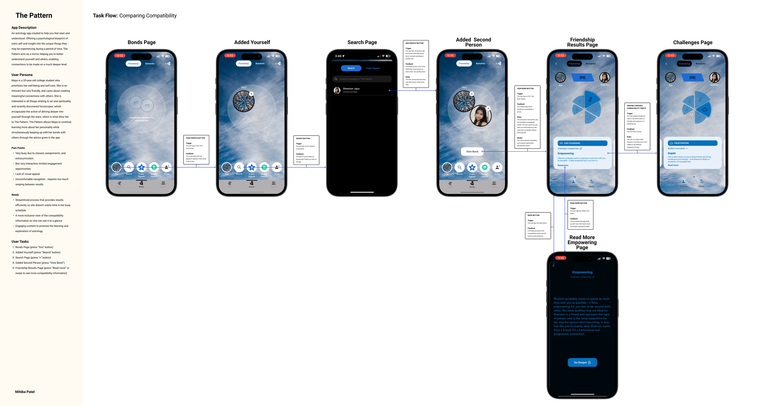
1
TASK FLOW
I stumbled across The Pattern while I was looking for an astrology app’s overall visual design was a bit too consistent, and quickly became boring to look at. All the pages had the same design for the results page and did not encourage excitement to the user. Additionally, the navigation for the results required the users to swipe far too much, which was uncomfortable. Finally, the app lacked a lot of movement, especially in terms of interaction. To improve all of this, I asked myself - “How can I make a memorable experience for users through micro-interactions, design, and creativity?”

2
APP FLOW
I then created an app flow to understand the elements of each of the micro interactions in the task flow. The four components include triggers, feedback, rules, and loops & modes, so I documented to understand how each of the interactions garnered engagement, captivation, and further user involvement.
3
PERSONA
To understand what needed to be improved upon and changed, I decided to create a user persona to put myself in the perspective of a user. I created Maya, a college student interested in art, spirituality, and horoscopes. By identifying her pain points and needs, I was able to figure out what I needed to focus on in my redesign.

4
REBRANDING
Following this, I started to ideate on branding my redesign. I brainstormed possible names for the app and landed on StarCrossed, as it was a a fun play on words as well as a name to describe a relationship. This aligned with the task flow I chose as well, viewing results between compatibility and traits of a relationship. I then decided to make the brand more friendly and cheerful by including bright pastel colors that I could utilize in the app for fun graphics and auras. I also chose simple yet aesthetic fonts, Be Vietnam Pro and Darker Grotesque, to go for more of a clean look. I also used Figma plugins to look into iconography and kept astrological ones for later use.

5
APP INTERFACE SKETCHES
A strong design always comes through ideation and iteration, which is why I decided to create 30 sketches of what the app could look like in terms of the visual interface. I let my creativity loose and brought in lots of elements of astrology like sun/moon/rising buttons for adding yourself, someone else and inviting someone. I also made all the icons in the navigation bar relate to astrology with the user’s sun sign, stars for the bonds, and a constellation for friends. Although this step took quite a bit of time, it was one of my favorites because I was able to see my ideas for the task flow come to life.

6
WIREFLOW
Converting my designs from pencil to Figma elements was the next step. However, the wireframes I made were put in order of the task flow and labeled with arrows from each trigger, signifying the way the app would run.

7
INTERACTION FLOW
From wireframe to Interaction (IX) flow, it was cool to see how the app started developing a personality and brand identity by adding the colors, fonts, and images. Documenting the microinteractions like the app flow was also essential in planning out the final animation and how it would work.

8
INTERACTION SKETCHES AND GUIDES
To prepare for the final render animation, I sketched out the steps of each of the individual interaction animations. Through this, I was able to understand and imagine how I wanted the movements to work and play out. I then converted these sketches to a guide on Figma with descriptions under each interaction, explaining how the interaction is triggered, and what occurs from it. I also included a key reference with hand gesture icons to illustrate what type of trigger was needed.


9
FINAL ANIMATION
For the final animation, I decided to use Jitter, a Figma plugin, to directly work from my Figma frames to animate. I worked on each microinteraction, focusing on the smoothness of the interactions, timing, and flow of the entire piece. I wanted a blend of consistency and unique ideas, with a play into the whole astrology idea. For consistency, I focused on making most new elements ease and expand into the screen, making sure not to overwhelm users by using a moderate speed. For the unique interactions, I focused on the telescope animation, which makes the user “look into” the telescope to “see the stars”. I thought this was a fun and playful idea, along with the constellation connecting the two souls after the telescope expands. I wanted the overall redesign and flow of the app to be more exciting and engaging for the user, really intriguing them in astrology and giving them a sense of spirituality in a fun way. After I had perfected the individual interactions, I moved them into a video editing software to combine the clips seamlessly and add an interaction gesture to indicate to my audience where the interactions were taking place. Through all this time and effort, I was able to create a convincing task flow app experience through an organized, step-focused design process.
Results:
Here’s the final render that I presented as a final to my class!
Final Animation - StarCrossed