
Wireframing Drexel’s Term Master Schedule
with Consideration of Design Principles

Project Overview:
Project Summary:
I created this project for a class that focused on various approaches for conceptualizing, designing, and evaluating user interfaces and user experiences. For this assignment, I worked in a group with four other students to fix an interface by wireframing. My team decided upon Drexel’s Term Master Schedule due to its lack of ease of use and challenging navigation system. Through research, knowledge of design principles, and teamwork, we were able to wireframe the original website and reorganize the content in a way that was more functional, usable, and efficient for users.
The Problem:
Term Master Schedule had a very packed screen density, bad organization, didn’t follow the inverted pyramid style, and had confusing symbols and signifiers. It was difficult for users to navigate through and achieve certain tasks. We each had all experienced frustrations with the site so we decided to improve it.
Goals:
As a designer, the goal I had for this project was to rewireframe the website so that it conveys its content more clearly to the user, and recompose the content to reach maximum efficiency and user satisfaction.
Design Process:
Organization & Research:
Initially, my team and I looked at the website together and talked about possible points to improve on. We worked together to recreate the wireframe that corresponded with the original website, to gain a better understanding of the site components, layout, and organization.

After this, each member of our team decided to make a wireframe by themselves, displaying the changes that could be made to increase functionality and usability. We each chose three design principles (from Don Norman’s “The Design of Everday Things”) to fixate our designs on. To do this, I made a list of the main issues in each of the sections of the website:
Description Section
This was the first section in the user’s view, but it was the least relevant
Browse Courses Section
The spacing was too close between the course options and could cause slips.
Search Courses Section
Had unclear signifiers (like the red asterisk and yellow arrow box next to the Search Courses button)
Had Uneven spacing with the “AND” & “OR”
The dropdown menu could cause slips due to the close spacing between the options
Out of these issues, I decided to focus my wireframe on improving the mapping, signifiers, and avoiding slips.
1.) Mapping
the relationship between controls and their effects through spatial correspondence
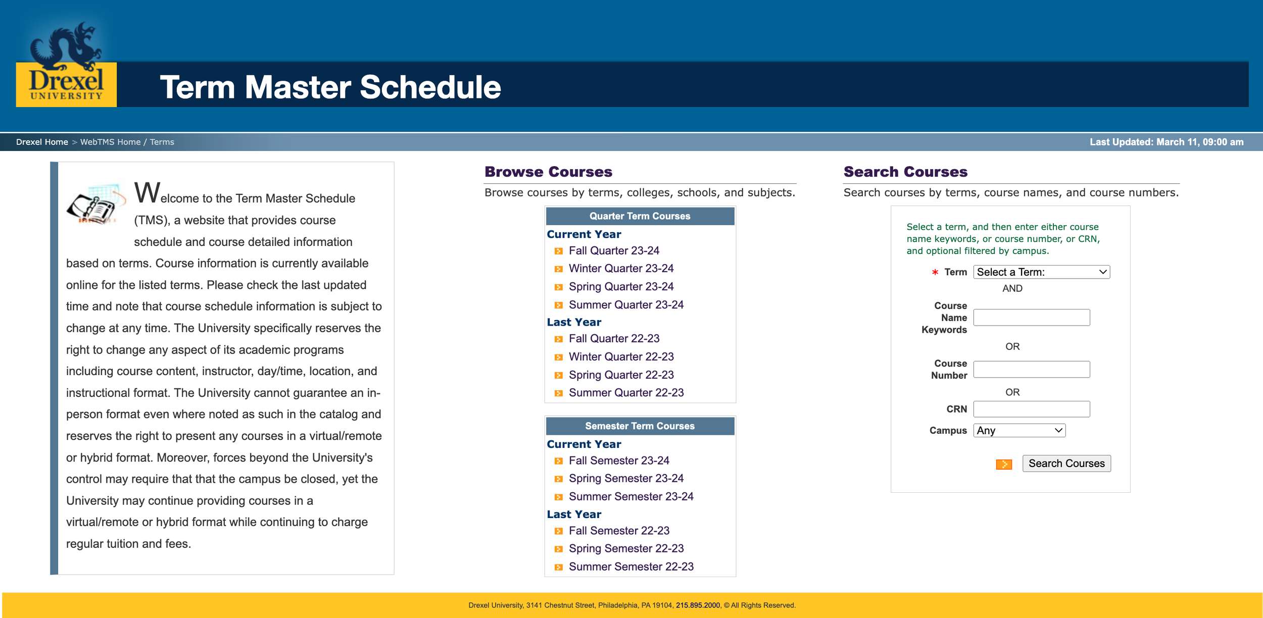
Original: the entire structure of the site is inefficient, and does not have good mapping. Despite its simplicity, the left column of content includes a long paragraph describing the website. This is like putting the about page on a website first instead of the home page – a long description of the site is not the most important content, so keeping that first in the reader’s view is not good mapping.
Wireframe Redesign: To fix this, the description paragraph should be moved to the bottom, and the “Browse Courses” and “Search Courses” sections should be at the top to let the users view the content by value. Additionally, the spacing in the “Search Courses” section is uneven, making the mapping even more inconvenient and not aesthetically pleasing. This could be improved by centering the text between the buttons and input fields in that section.
This image shows the "Welcome" section of the Term Master Schedule. It's the first thing users see, but it's not the most important. The homepage mapping could be reorganized to highlight the most important content first.

This image depicts the Term Master Schedule home page I redesigned through wireframing. I enhanced the mapping to order the sections of the site by significance and fixed the spacing between the buttons/input fields in the “Search Courses” section.
2.) Signifiers
Signals, labels, or signs that indicate what action needs to be taken
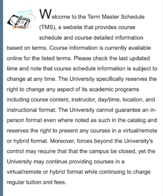
Original: In the Term Master Schedule’s “Search Courses” section, the little yellow box with a white arrow pointing towards the “Search Courses” button does not do anything. Although it signifies to the user to click on it and see what is next, it has no effect, which shows that this signifier needs to be removed. Another unclear signifier is the red asterisk in the same “Search Courses” section. The red asterisk typically signifies that a user must fill out that certain input field, and it is only seen next to the “Term” input field. Although there is a small paragraph above the input fields indicating the directions, the red asterisk signifies that only the term section needs to be entered, and the rest are optional. However, this is not the case since the user needs to enter more information to find the course they are looking for.
Wireframe Redesign: To fix this, I removed the signifiers from the Term Master Schedule home page entirely due to the lack of clarity and inability to offer proper feedback to the user.

This image depicts the Term Master Schedule “Search Courses” section. Here, you can see the red asterisk, uneven spacing, and the arrow signifier that need to be removed to improve the user experience.

This image depicts the Term Master Schedule “Search Courses” section that I redesigned in my wireframe. The structure is the same, but I removed the signifiers (the red asterisk and the yellow box with the white arrow) to clear confusion for the users.
3.) Slips
When users intend to perform one action but accidentally perform another
Original: On the website, the “Browse Courses” section has the options for terms close together, making it easier for the user to accidentally click the wrong term. Additionally, when the user presses the “Select a Term:” button in the “Search Courses” section, the terms are very close together and it is a little difficult for the user to easily pick the right one.
Wireframe Redesign: I evened out the spacing and organization so the slips could be avoided completely by the users. I reorganized the content and increased the spacing between the text and dropdowns.

This image depicts the “Browse Courses” and “Search Courses” sections of the Term Master Schedule home page. This image displays the close spacing of the terms to view courses, which can cause slips easily.

This image depicts the “Browse Courses” and “Search Courses” sections of the Term Master Schedule home page wireframe I created. This image displays the increased spacing and new form of dropdown to help the user navigate through the site without any slips.
Results:
Out of all the wireframe redesigns my group and I made, we chose mine to present to the class. I noted that mapping, signifiers, and slips were some large issues in the user experience, and was able to fix all of them in different ways. I improved the mapping by reorganizing the content, from most important to least important. I removed the signifiers since they don’t provide feedback or increase clarity for the user experience. Lastly, I helped avoid slips in my wireframe by increasing the spacing between the text and dropdowns. I was able to take my knowledge from both Don Norman’s book and what we learned in class to apply it successfully to this assignment. This knowledge helped me evaluate the qualities of the Term Master Schedule layout with more detail and allowed me to analyze my observations of the design more closely. This assignment of testing my understanding of design principles and concepts through The Design of Everyday Things and this class helped me to establish my learnings and apply them to everything I see because design is all around us.

These two images depict my new wireframes for the updated look of the Term Master Schedule website. These wireframes were created after my consideration of improving the website through mapping, signifiers, and avoiding slips.